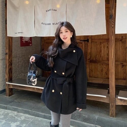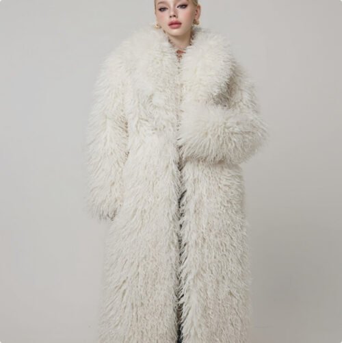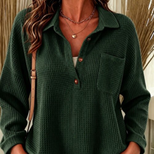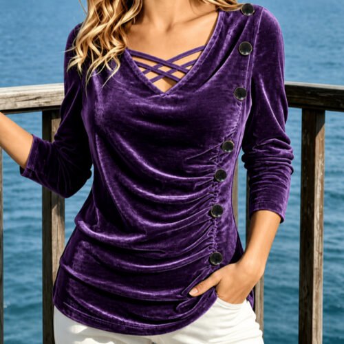

Combining different colors and patterns within a single outfit can intimidate even style-conscious individuals. When executed without a strategy, clashing prints or competing hues can feel chaotic and overwhelming. However, mixing colors and patterns is actually rooted in simple visual mechanics—understanding scale, color harmony, texture contrast, and visual anchors.
Mastering these core principles allows you to step beyond basic head-to-toe neutrals, building dynamic, memorable, and polished outfits with confidence.
1. The Science of Color Pairing
To combine colors effectively, rely on the classical color wheel as your visual roadmap.
-
Monochromatic Pairing: Styling variations of a single hue (such as light sky blue paired with deep navy, or cream paired with rich camel). This is the simplest way to introduce color depth while maintaining a streamlined look.
-
Analogous Pairing: Combining colors that sit side-by-side on the color wheel—such as olive green and mustard yellow, or rust orange and burgundy. Analogous combinations feel rich, organic, and harmonious.
-
Complementary Pairing: Pairing colors directly opposite each other on the color wheel—such as navy blue and deep amber orange, or forest green and dusty pink. To keep complementary pairings refined, ensure one color is muted or acts as the dominant tone, using the second color as a smaller accent.
2. The Golden Rule of Pattern Mixing: Varying Scale
The most common mistake when combining two patterns is selecting prints of equal size. When two micro-prints or two large-scale prints are paired together, the eye doesn’t know where to focus, creating visual confusion.
┌─────────────────────────────────────────────────────────────┐
│                 PATTERN PAIRING FORMULA                     │
├─────────────────┬──────────────────┬────────────────────────┤
│ Primary Pattern │ Secondary Pattern│ Why It Works           │
├─────────────────┼──────────────────┼────────────────────────┤
│ Large-Scale     │ Micro-Scale      │ Clear visual hierarchy │
│ Floral or Plaid │ Stripe or Dot    │ keeps prints balanced  │
│                 │                  │                        │
│ Bold Wide Breton│ Subtle Glen Plaid│ Linear structure holds │
│ Stripe          │ Trousers         │ the look together      │
│                 │                  │                        │
│ Bold Animal     │ Fine Pinstripe   │ Pinstripe acts as a    │
│ Print Accent    │ Shirt            │ structured neutral     │
└─────────────────┴──────────────────┴────────────────────────┘
-
Large Scale + Small Scale: Pair a large, sweeping plaid blazer with a fine, delicate pinstripe button-down shirt. The variance in scale establishes a clear visual hierarchy.
-
Vary Pattern Shapes: Combine geometric prints (stripes, checks, grids) with fluid, organic prints (florals, paisley, abstract shapes). The structural contrast keeps the patterns from competing.
3. Anchor Your Outfit with a Shared Color
When pairing two completely different patterns—such as a striped sweater and a floral midi skirt—ensure both prints share at least one common grounding color.
-
The Grounding Hue: If your floral skirt contains navy, forest green, and soft pink, selecting a striped top that incorporates navy creates an instant visual bridge. The shared color tricks the eye into perceiving the two separate prints as a unified ensemble.
-
Rely on Neutral Grounds: Utilizing navy, white, black, gray, or beige as the background color for both prints automatically keeps the overall outfit cohesive.
4. Use Neutral “Breathing Room”
When wearing multiple bold colors or prints, your outfit requires visual “rests” so the overall look remains balanced rather than overwhelming.
-
Incorporate Solid Neutrals: Ground a bold pattern-on-pattern combination with solid foundational layers—such as a plain white t-shirt tucked into a printed skirt beneath a tailored solid trench coat, or solid leather footwear.
-
Breathing Space at the Waist: Using a solid minimalist leather belt creates a distinct border between a patterned top and patterned bottoms.
5. Step-by-Step Starter Formulas for Beginners
If you are new to mixing patterns and colors, start with these tested, low-risk combinations:
-
The Classic Breton Stripe + Subtle Print: Combine a black-and-white striped Breton top with a houndstooth or glen plaid blazer. Stripes function almost like a solid neutral, making them the easiest pattern to pair.
-
The Grounded Accent Color: Pair an all-neutral outfit (charcoal trousers, white shirt, gray blazer) with two distinct colored accessories from an analogous family—such as a deep burgundy leather bag and a forest green wool scarf.
-
The Micro-Polka Dot + Bold Plaid: Pair a small-scale micro-dot silk shirt unbuttoned under a structured, wide-grid plaid coat, grounded by dark denim.
Frequently Asked Questions
Which patterns are considered “neutral”?
Breton stripes, delicate pinstripes, micro-polka dots, and subtle houndstooth are widely treated as “pattern neutrals” by stylists. Because of their clean, repetitive geometry, they pair effortlessly with almost any other print, bold color, or graphic without clashing.
How many patterns can I wear in a single outfit?
For a balanced, professional, or elevated look, stick to two distinct patterns per outfit. Adding a third pattern requires precise control over scale, color anchoring, and tailoring, which can easily tip the ensemble into feeling overly busy.
About the author : Kevin Demitri